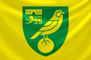
Together with industry-leading agency SomeOne, whose work includes similar projects at Tottenham Hotspur, Manchester City and Wolverhampton Wanderers, the club has created a modernised, evolved crest which will ensure consistency across all digital, print and physical branding.
The club has recently undergone a review of its brand, which confirmed a number of technical challenges and accessibility issues centred around the main club crest. There were also inconsistencies with the versions of crests used, with different iterations around our own stadium and incorrect crests easily accessible online.
The new crest features a redesigned lion, castle and canary, each of which have been redrawn to overcome the technical issues found. By simplifying the elements and removing a lot of the unnecessary detail, the crest now renders strongly in both small and large scale.
The black keyline around the crest has also been removed, with the balance improved by positioning the ball in the centre of the crest.
Whilst the crest is at the heart of the project, it will be supported by a bespoke club font and new brand property, both of which will be revealed in the summer of 2022.
The entire process incorporated both internal feedback within the business and external feedback from the club’s supporters.
The crest will be introduced and formally used from June 17, 2022. The 2022/23 kits will be revealed shortly after, which will feature the evolved crest for the first time.
For more information on the background, timeline, technical challenges and process, please head to norwichproject50.co.uk.
Commercial director Sam Jeffery said: “This is a huge moment in the history of Norwich City Football Club and a real statement of intent for the future. For the first time in 50 years the club will adopt a newly evolved crest, fit for digital purpose, iconic and most importantly accessible for all.
“It’s a project two years in the making and one that has been treated with the utmost sensitivity and care by those lucky enough to have been involved within the club’s working group.
“Having garnered feedback from numerous stakeholders, both internally and externally, it was always going to be an evolution and not a revolution. We’re extremely proud of the outcome.”
Executive creative director of SomeOne agency Rich Rhodes said: “When we started the project, we knew it was going to be something really interesting for us.
“Speaking to everyone from the owners and the board, players, fans and staff, we could tell that there’s something really special at Norwich; this real sense of community, pride and passion. It’s something that we really wanted to bring to the fore in the work that we’ve done.
“It’s really important to keep those historic, distinctive elements of the crest. It wasn’t a case of going in and making a fundamental change. It was about taking all of the best bits and making them even better and fit for purpose for a digital age.”
