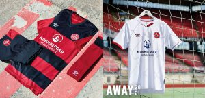
 After securing their place in Bundesliga 2 in dramatic fashion, ending what has been a surreal and disrupted season, 1.FC Nürnberg today look forward to the season to come, unveiling their new home and away kits.
Not many clubs in German football can boast such a long and storied history as FCN. As one of the most successful professional teams of all time, respect for ‘Der Club’s’ heritage, and commitment to tradition are key when designing new kits. It is no easy feat to synthesise almost 120 years of passion, pain, glory, and support into a uniform that feels both contemporary, and timeless.
Designed by UMBRO, the FCN home and away kits for 2020/21 boldly seek to be the perfect combination of tradition and technology, with subtle uses of modern techniques and stylistic flair throughout.
For the home kit, red and black body hooping is employed across the front of the jersey; an eye-catching re-contextualisation of the Bavarian side’s classic colour combination. Layering in elements from the Franconian flag, jet-black extends across the shoulders and upper arms, drawing the attention on the rear of the shirt to the custom ‘Der Club’ sign off on the rear neck. The collar itself is a club-first use of a rounded design with a smart, futuristic elongated-U detailing, maximising comfort and minimising irritation.
All-black shorts continue this theme of subtlety with the use of thin, horizontal red piping on either side, accentuating the full-colour club crest, and the use of tonal red on the socks. Topped with a bold black hoop, and with integrated cotton footbeds, the socks of all 1.FCN kits for the season ahead feature the word ‘Club’ emblazoned proudly on the rear upper ankle.
Over a century of kit colour consistency for FCN dictates that a brilliant white should form the base of the club’s away kit for each season. Although 2020/21 will be no different, a number of intricate details are woven in, designed to elevate an already established classic, and create a real sense of timelessness.
The use of white and light grey horizontal micro-stripes gives texture to the entire torso, and creates a sleek, contemporary backdrop for a white/red club badge and crimson UMBRO double diamond. This sense is only heightened by the low-key use of asymmetry, on what otherwise is a real minimalist design. Contrasting Franconian red/white and all-red cuffs and paneling on the lower-collar sets this Away jersey apart, and are complemented by all-white shorts and socks.
The use of a dropped hem on both jerseys allows for the flexibility of shirts that can be worn in both performance and casual situations, creating pieces for players and fans alike. Let’s hope it’s not too long before we see the new shirts on both the pitch and in the stands of the Max Morlock Stadium, and that FCN can kick on and bring even more joy to the close-knit fan community that have stuck by them through a testing year.
 Arunava about Football A look at football & the world through my eyes!


